One of my many fascinations with airlines is branding. I have always enjoyed the glamour shots airlines use in their commercials, and I love it when I’m at the airport and there is a row of airliners, each with its own tail logo. Branding an airline is a tricky proposition. It has to reflect what kind of airline it is marketing itself as. It also has to be understood by people across cultural and language barriers.
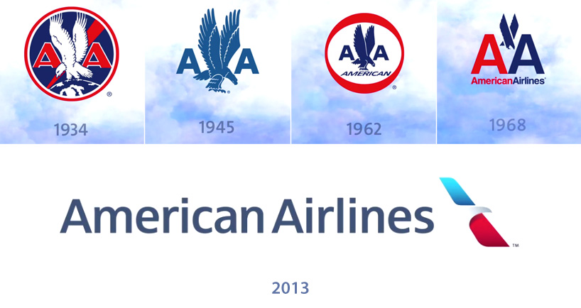
American Airlines branding has always included an eagle and watching that eagle evolve over the years has been fascinating! The 1968 logo is as old as I am. It is one of the best examples of modern airline branding or product branding of any kind. Very few airlines have been that iconic. Only Lufthansa comes close to American in longevity and the class that American’s “Scissor Eagle” logo represents.
But changing times demand changing branding. From the mid ’90s to the present day American Airlines has fallen on hard times. There are many factors that led to that sad state. However, today we are dealing with the “New American.” A trip through bankruptcy and a merger with USAirways has created the world’s largest airline. The New American is ready to enter a new, hopefully resurgent era and it needs a fitting brand update.
Before the merger, American spent huge amounts of money for a full rebranding effort. The silver fuselage has gone. New aircraft are made of plastic that can’t be shined. So the Scissor Eagle – which demanded this glossy has been replaced with a much more abstract version. It is elegant but barely looks like an eagle.
The biggest shock to many people was the new livery on the tail of the American fleet. It is an abstraction of the United States flag. To say it has been a divisive issue is a gross understatement. I wasn’t a fan but once I saw it in real life, it has grown on me.
Doug Parker is the CEO of the New American. I have to give him credit as he has been working hard to instill pride in the New American by the workgroups of the Old American and USAirways. Having been made aware of how controversial the new branding is, he decided to create a new hybrid livery that uses the original Scissor Eagle logo on the new fuselage.
But I just hate the hybrid livery! There are two versions of the eagle! It sends a mixed message. American Airlines is working on becoming a global world-class brand. To my eyes, the hybrid livery looks cheap and amateurish as if somebody got creative with Photoshop.
This isn’t the first time Doug Parker has been at the helm of bad branding. He was CEO of America West during the merger with USAirways. Each airline had it’s own branding that worked pretty well. I particularly liked the old America West livery. It used visual cues of the United States southwest. It fit the type of product America West provided.
USAirways was in turmoil before the merger with America West. They were rebranding and in a bad place before the merger. The livery wasn’t exactly inspiring but it was an attempt to give the impression of a major international carrier. I think the effort fell flat.
So the New USAirways livery was created using bits and pieces of both carriers. Like the New American hybrid, it looks cheap and inept. USAirways’ product was also low-rent albeit profitable
So what is the future of the American Airlines aircraft livery? Doug Parker is letting the employees decide, a pretty brilliant way to keep employees invested in the New American.
Dear American Airlines employees: Please, for the love of all things commercial aviation, do not fall back on the old Scissor Eagle! I understand your nostalgia for it but its time has passed. Look to the future!
As for you USAirways staff: Remember you are the NEW American. As such make American Airlines your own.
One consolation Old American employees will have is that Doug Parker has announced that the New American will keep the USAirways tradition of having one aircraft in the fleet painted in the livery of the airlines that merged to create the new airline. The Scissor Eagle will survive if only on one retro-themed aircraft!
